Science Across America
Client: STAR Net Libraries | HHMI Tangled Bank Studios
This campaign celebrates America’s 250-year anniversary by helping libraries highlight scientific achievement in their communities. Science Across America invites libraries to engage their communities with focused Community Dialogues, host educational activities, and bring focus to the past, present, and future of science in our lives.
-
Graphic Designer
Illustrator
Layout Designer
Instructional Designer
-
The client needed a fun and playful visual identity that celebrates science without relying on familiar cliches or literal imagery. The project’s target audience is children, teens, and families. Deliverables included a logo, custom illustrations, UI elements for the online map, and illustrated printed maps that gave libraries materials to showcase science in their communities.
-
Adobe Creative Suite
Logo Exploration
The logo drafts went through several iterations as the name of the project changed based on project advisor feedback. The initial design drew upon the atomic age of science which gave a nostalgic, community-driven feel. As the project evolved I took away the atomic symbol as that was too limiting on the broad scope of science.
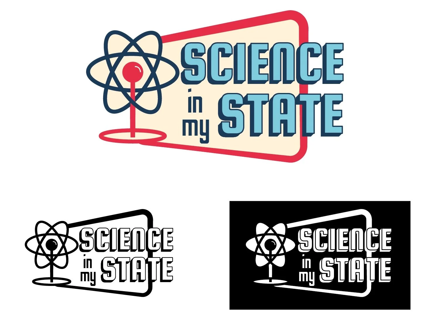
Initial direction around atomic age design. The client requested the use of red, white, and blue. I suggested these colors that are similar but are softer and friendlier.
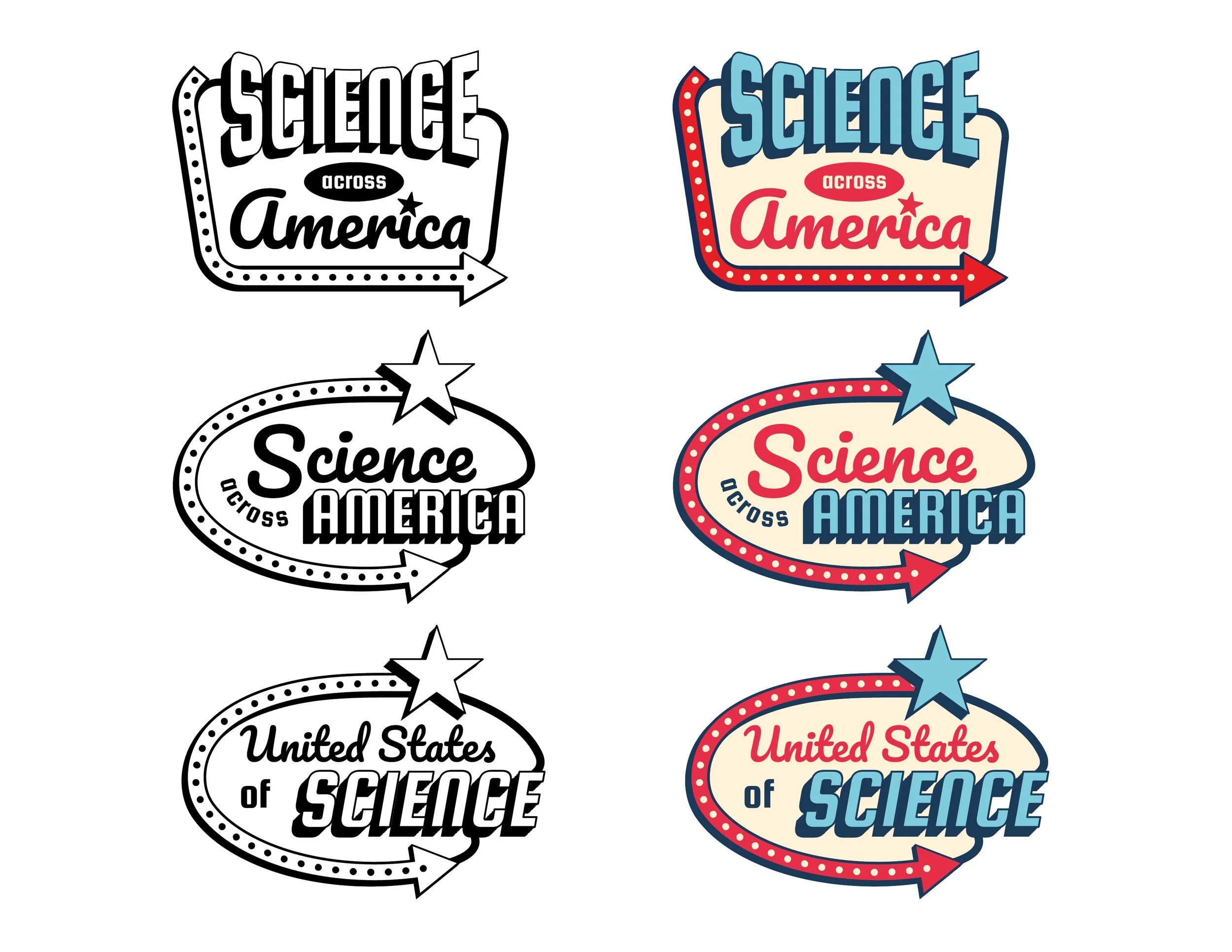
The atomic symbol was taken off and the logo took on a more road way signage appearance.
The project name was changed to encompass not only states but United States territories. A decision had to be made between these two names.
Final Design and Direction
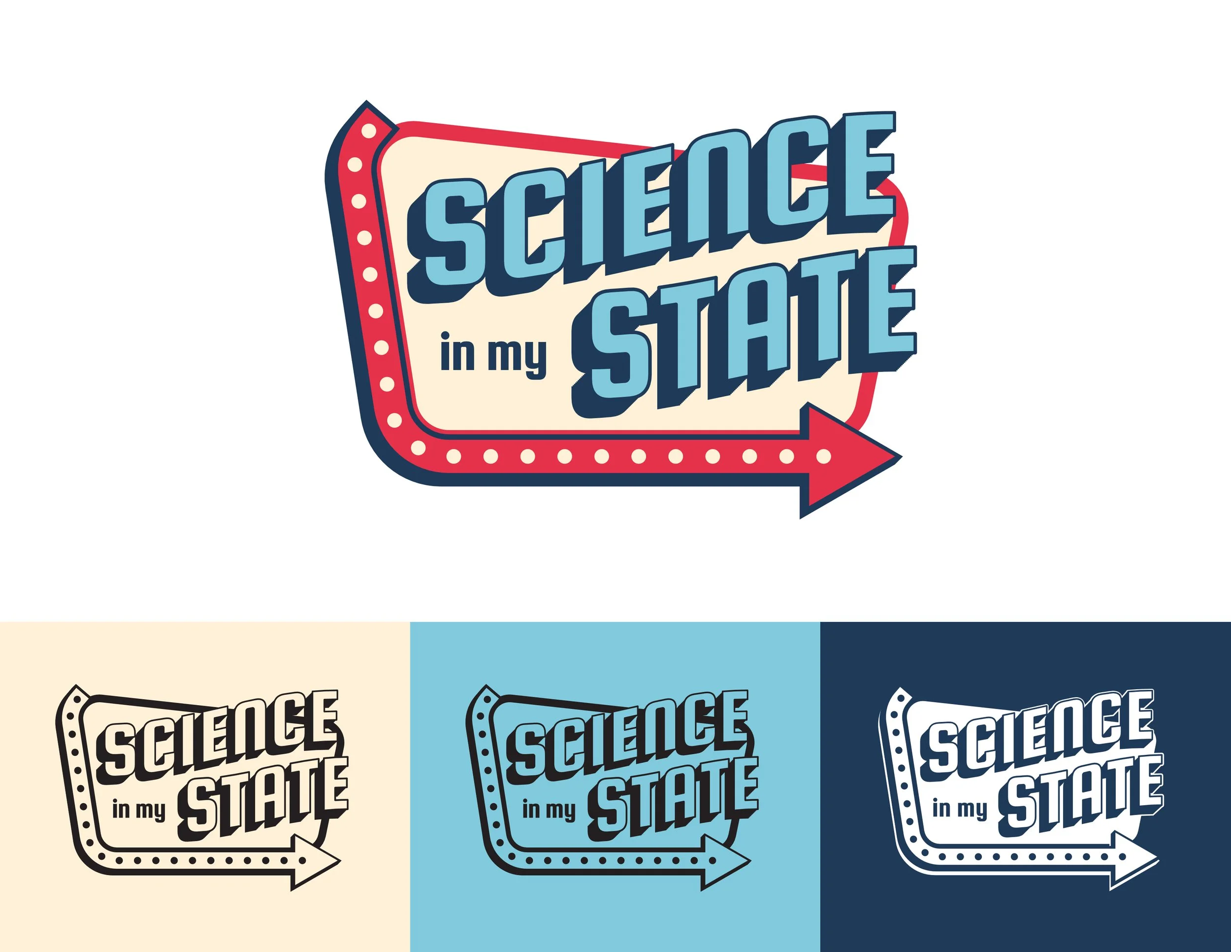
Science Across America was the final chosen name. The direction went from atomic age to a vintage style road trip. The direction gave more flexibility on graphics while also showcasing all the states and territories.
Art Direction
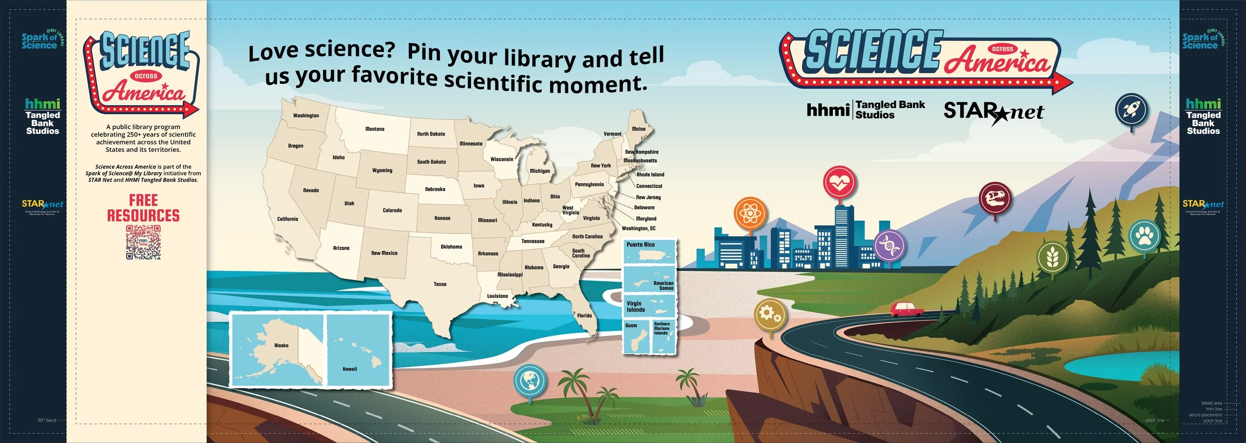
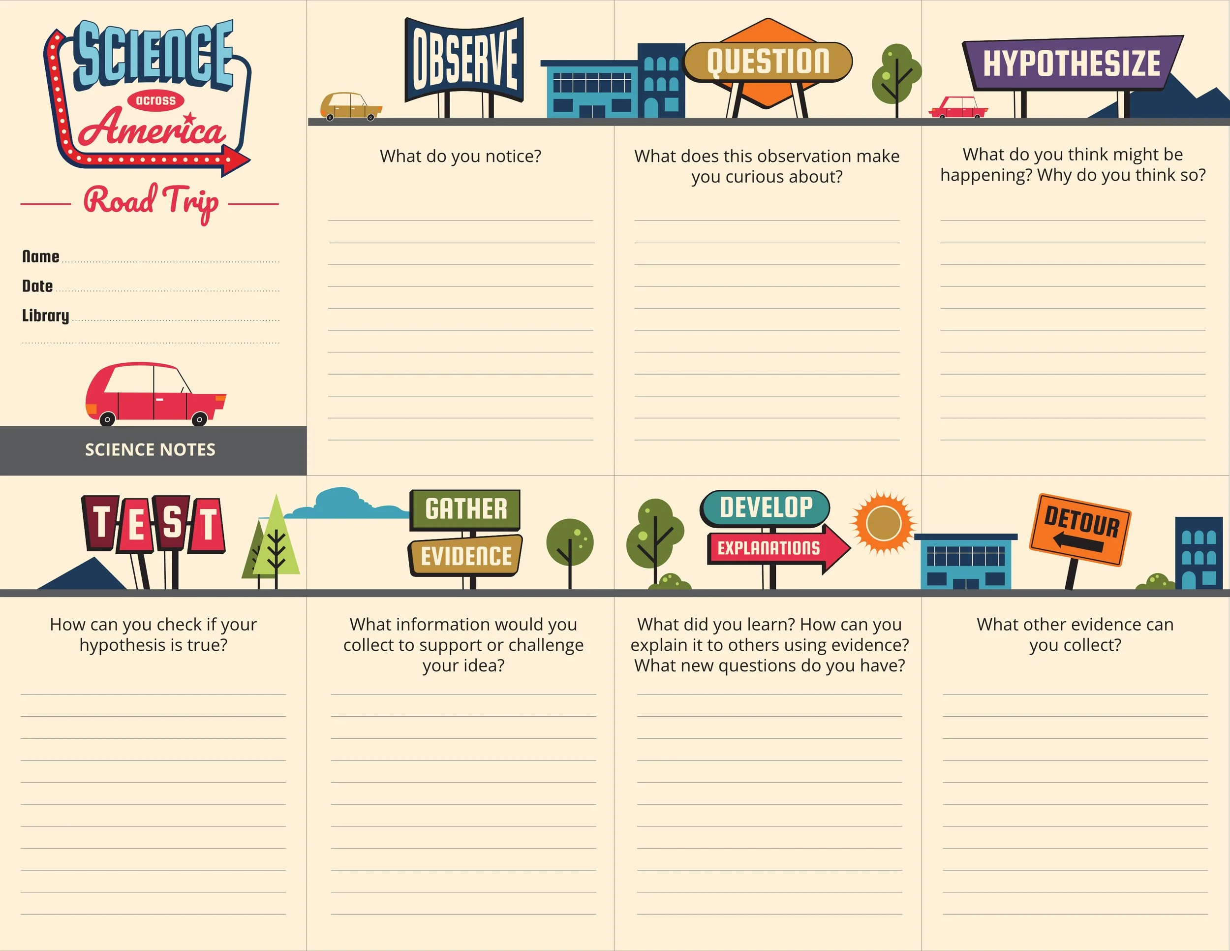
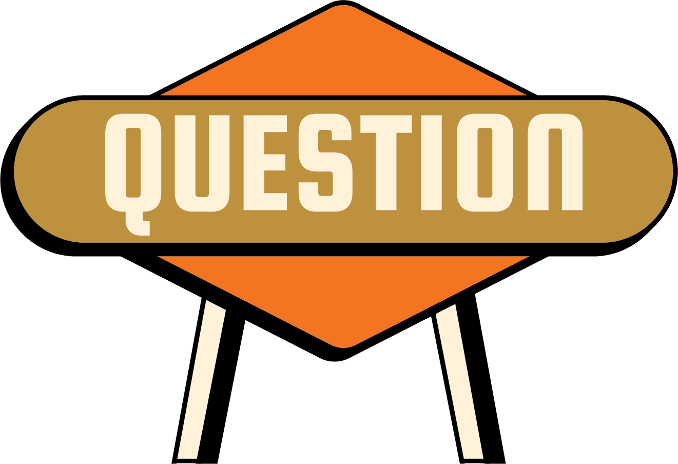
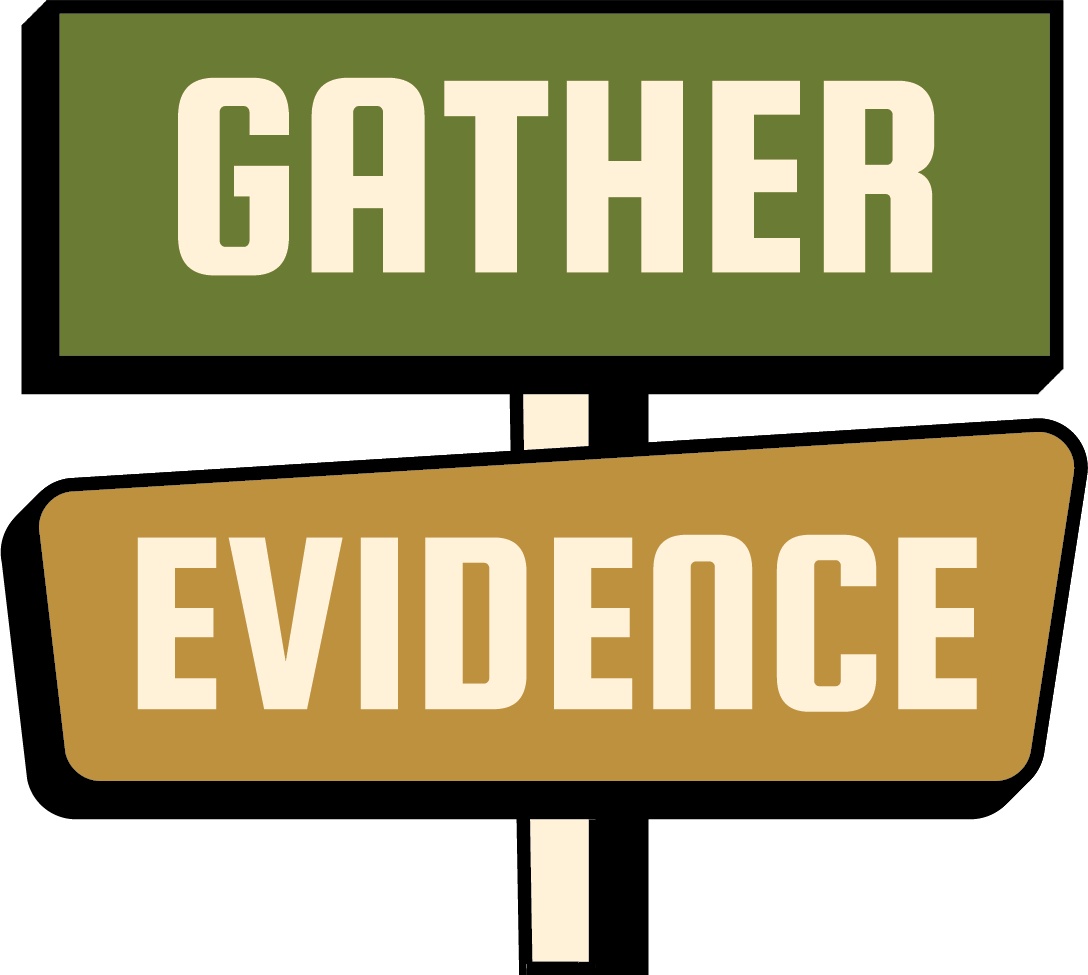
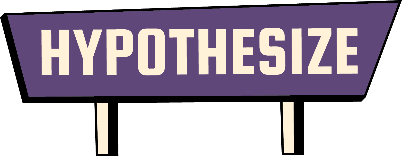
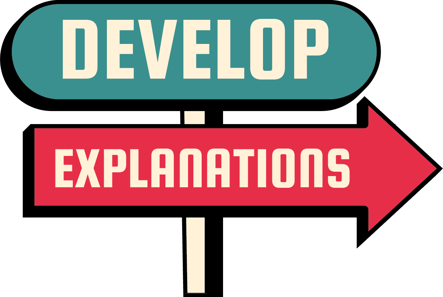
Mid-century modern illustration served as the primary inspiration for the visual style. I designed a set of simple, logo-inspired signage graphics that were used throughout the campaign's activities.



Printed Maps
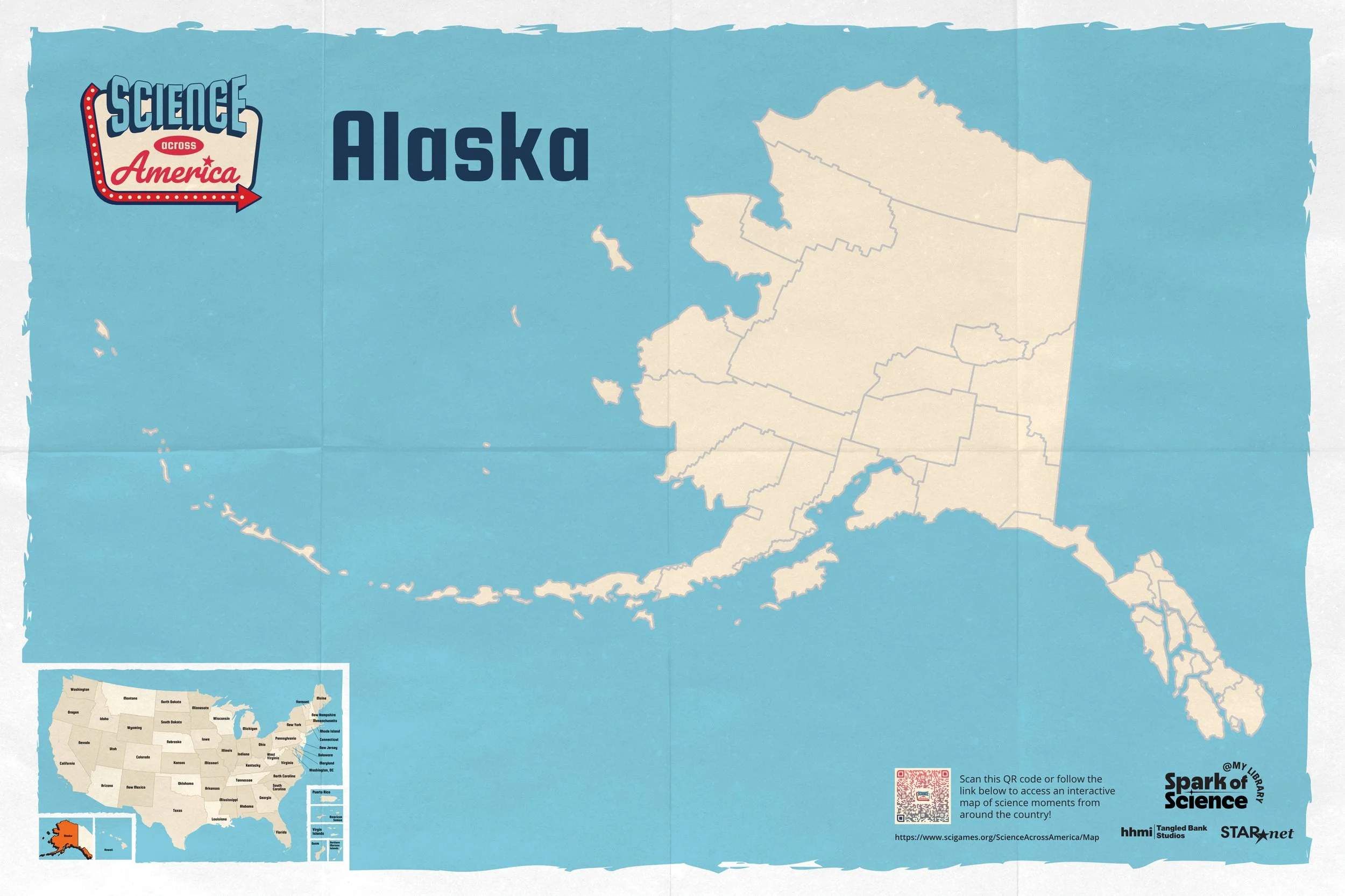
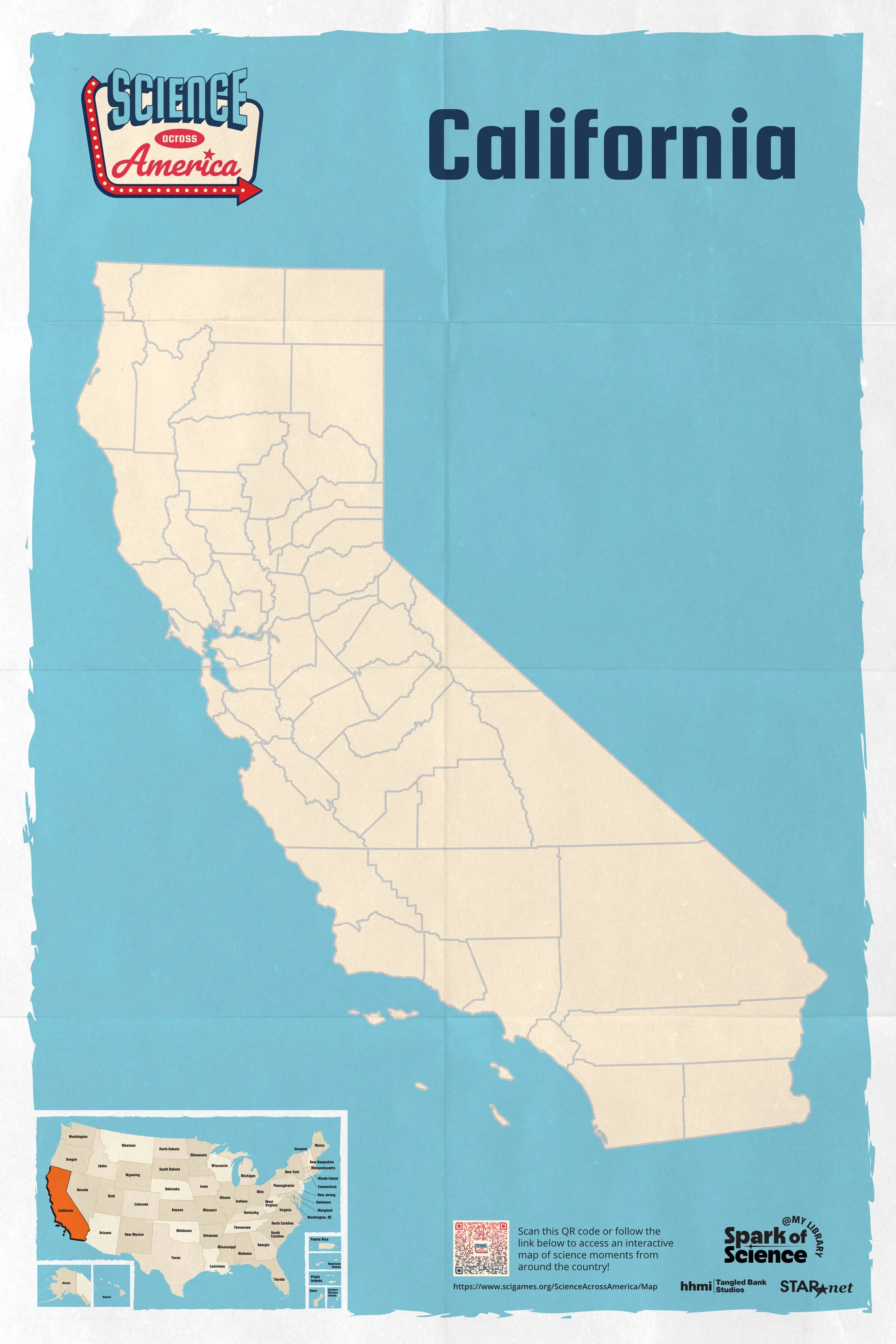
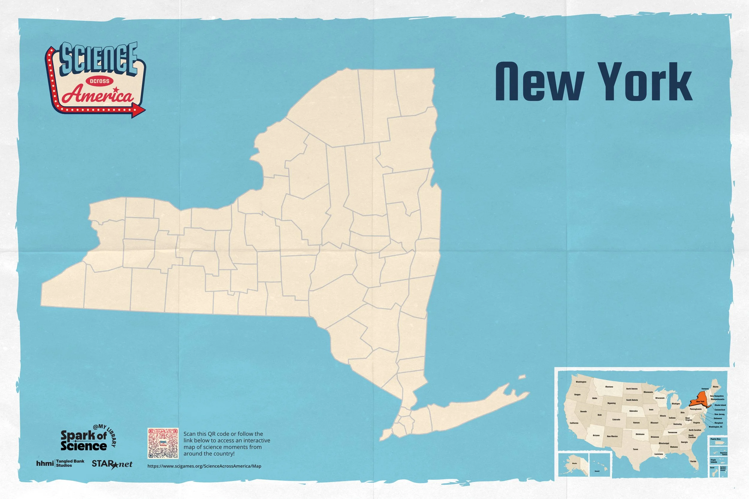
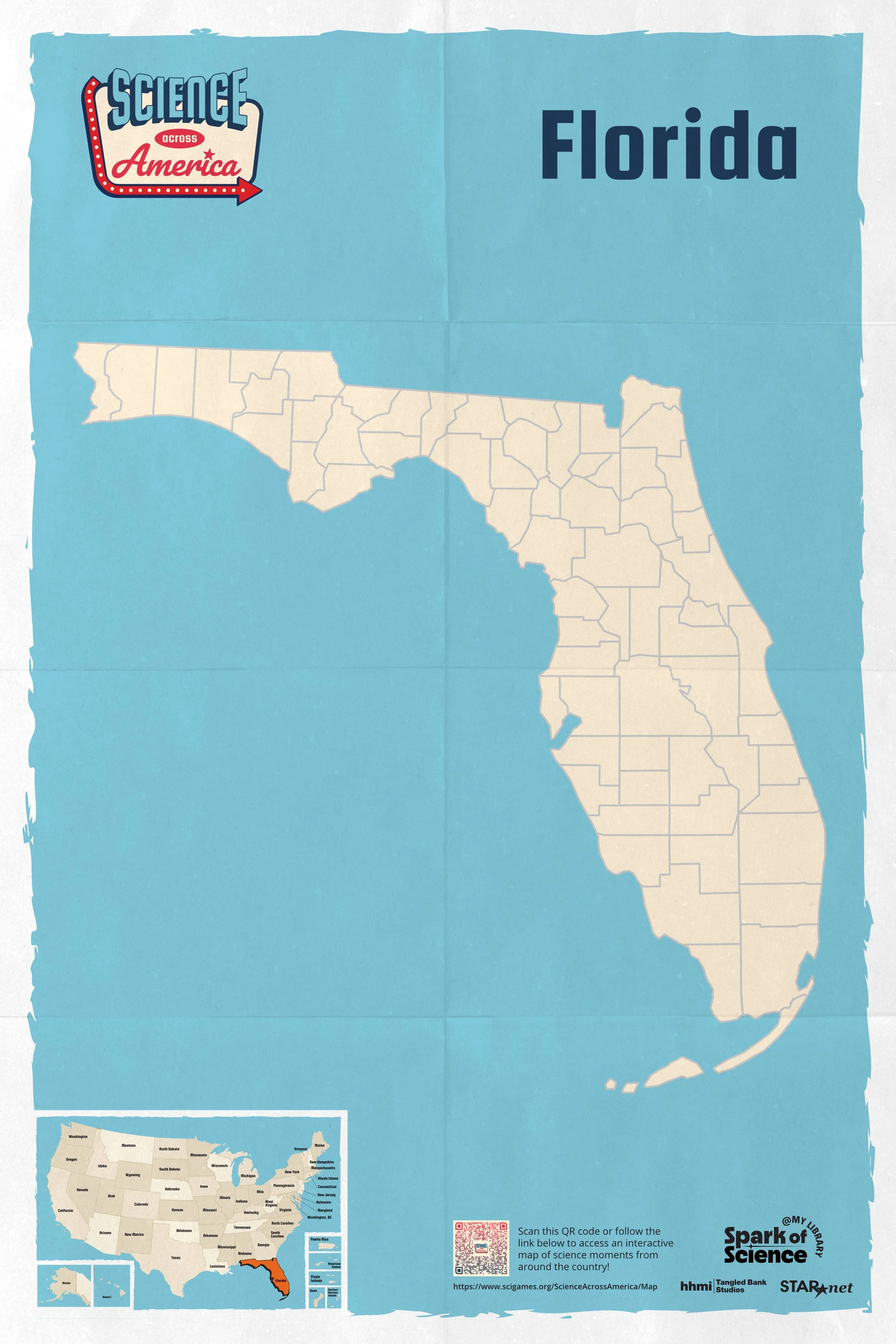
Each U.S. state and territory library accepted into the campaign received a printed 24" × 36" map. To streamline production, I developed a layered Adobe Illustrator file system that kept every map visually consistent while making individual elements easy to edit.
Online Interactive Map
This interactive map was a central component of the campaign. I designed the UI to align with the campaign's printed materials, creating a cohesive visual experience across digital and print.
Explore the final interactive map: Science Across America Map
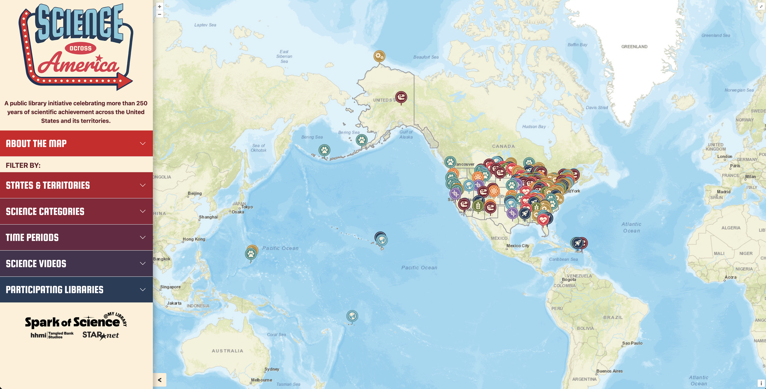
As the map's categories and content evolved to meet the client's needs, I created multiple iterations of the sidebar UI and collaborated closely with our developer to refine the user experience.
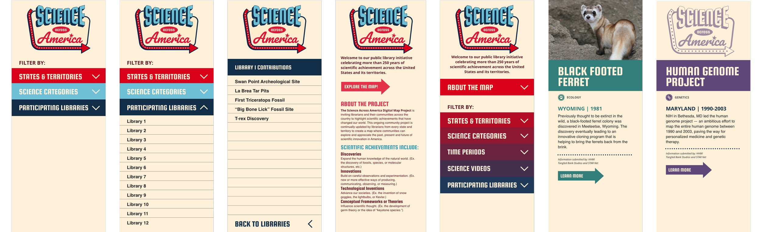
One of the project's key challenges was organizing the science categories so they were easy to navigate without feeling overwhelming, while ensuring each remained visually distinct. I designed a set of simple, recognizable icons to represent each science category and participating library.



Conference Booth
This campaign was featured at the 2026 American Library Association (ALA) Conference, providing an opportunity to introduce libraries to the initiative and its offerings in person. I was responsible for designing a 20-foot-wide interactive backdrop that incorporated key client-requested elements, including a large map of the continental United States and its territories, along with a bold, eye-catching illustration that drew attendees into the space.